Typography in Apparel Design: A Designer's Guide
- Vain.

- Jun 9
- 8 min read

Typography in apparel design is the deliberate art of arranging type to create legible, brand-resonant visuals on clothing that communicate identity before a single product description is read. The role of typography apparel design plays goes far beyond choosing a font. It shapes how consumers perceive price, quality, and personality at a glance. For design students and apparel designers, understanding type as a strategic tool rather than decoration separates forgettable garments from iconic ones. This guide covers the psychological, technical, and practical dimensions of apparel typography so you can apply them with confidence.
How does typography shape brand identity in apparel design?
Typography is the first visible manifestation of a brand’s promise, arriving before the garment itself is fully processed by the eye. 83% of designers state typography critically shapes consumer perception of price, quality, and personality before any physical interaction occurs. That figure means your font choice is doing branding work the moment someone glances across a room.
“Typography acts as a silent storyteller, establishing brand voice consistency across all fashion touchpoints, essential for long-term equity.” — Din Studio
Font styles carry deep emotional and cultural associations that operate below conscious awareness. Serif typefaces like those used by Vogue or Ralph Lauren signal tradition, authority, and heritage. Sans-serif faces like those favored by brands such as A.P.C. or Acne Studios project modernity, clarity, and accessibility. Script fonts suggest intimacy and craft. These associations are not arbitrary. They are built from decades of cultural conditioning, and consumers respond to them instinctively.
Consistency across collections is where typography earns its long-term value. Typography functions as an anchor branding element that keeps brand cohesion intact despite changing seasonal collections. A brand that switches typefaces every season trains its audience to feel nothing in particular. A brand that commits to a typographic system builds recognition that compounds over time, the way Balenciaga’s condensed grotesque or Supreme’s Futura box logo have become cultural shorthand.
Key psychological associations designers should understand:
Serif fonts communicate heritage, luxury, and editorial authority
Sans-serif fonts project modernity, minimalism, and democratic accessibility
Condensed sans-serifs convey energy, urgency, and streetwear credibility
Wide-tracked capitals suggest calm authority and premium positioning
Script and handwritten fonts evoke craft, personality, and artisanal quality
The graphic design for clothing decisions you make at the typeface level set the entire emotional register of your line before production begins.
What technical factors must designers address when applying type to garments?
Typography on apparel functions more like signage than editorial design, and that distinction changes every decision you make. Apparel typography requires exaggerated hierarchy and generous spacing because garments are read at a distance, in motion, and under variable lighting conditions. The rules that work on a screen or a printed page do not transfer directly to a T-shirt or a jacket.
Here are the core technical considerations every apparel designer must address before finalizing type:
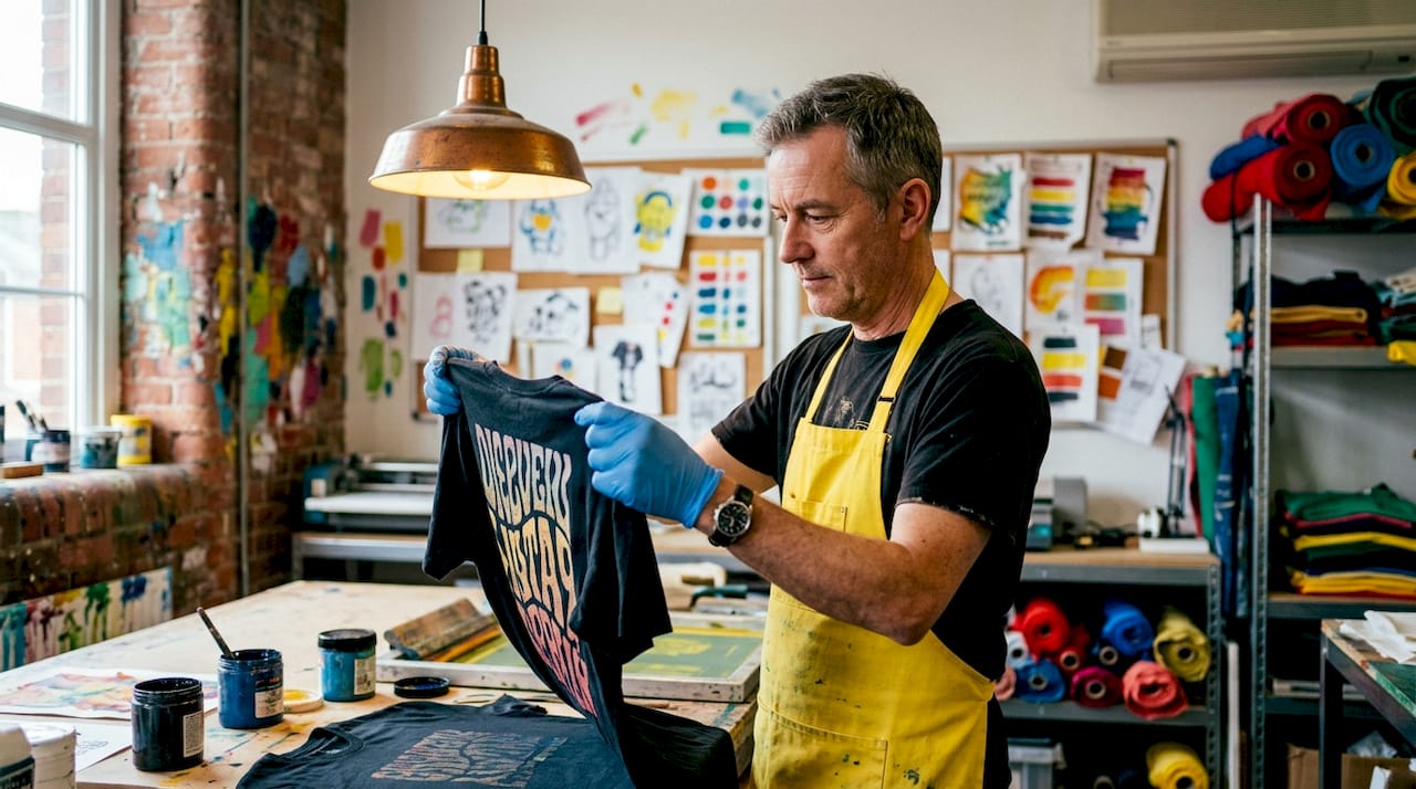
Print method compatibility. Screen printing, DTG (direct-to-garment), DTF (direct-to-film), and embroidery each impose different constraints. Embroidery cannot reproduce fine strokes. Screen printing struggles with very thin letterforms at small sizes.
Font weight and stroke contrast. High-contrast typefaces with thin and thick strokes lose their thin strokes in screen printing and on textured fabrics. Opt for medium to bold weights with consistent stroke widths for most print methods.
Tracking and leading. Tracking and leading adjustments influence brand tone more than typeface selection alone. Tight tracking projects aggression and urgency. Wide tracking communicates calm authority and premium positioning. Adjust both parameters intentionally, not by default.
Fabric texture and color. Dark fabrics require higher contrast and bolder weights. Textured fabrics like fleece or canvas cause ink spread, which closes up tight letterforms and thin strokes.
Size hierarchy. Industry best practices recommend a two-font hierarchy system with a size ratio of at least 3:1 between headline and supporting text. This prevents visual noise and maintains legibility at a glance.
File preparation. Converting text to outlines before sending files to print is non-negotiable. It preserves letterform integrity regardless of whether the printer has your font installed.
Pro Tip: Script and handwritten fonts are high-risk in apparel printing because ligatures close up or disappear on textured fabric surfaces. If a script font is central to your brand, test it at production scale on the actual fabric before committing to a full run.
Print Method | Font Risk Level | Best Font Style |
Screen printing | Medium | Bold sans-serif, medium weight |
DTG | Low | Most styles, including moderate serifs |
DTF | Low | Fine fonts now viable with care |
Embroidery | High | Bold, simple letterforms only |
Sublimation | Low | Most styles on light fabrics |
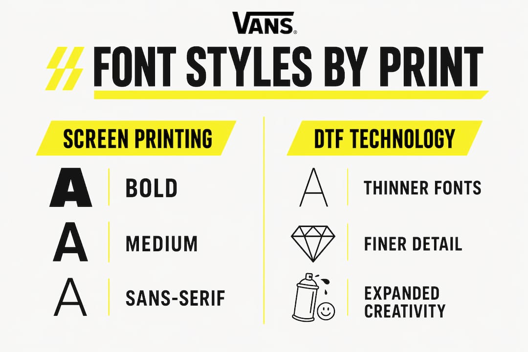
Emerging DTF technology now allows finer, thinner fonts on apparel, expanding creative possibilities that were previously off-limits. This shift gives designers more expressive range, but the convert-to-outlines rule and licensing checks remain non-negotiable regardless of print method.
How do typography trends interact with fashion aesthetics?
Typography both reflects and drives fashion aesthetics, and the relationship between the two is more reciprocal than most designers realize. Minimalist fashion movements demand typography that is precise and restrained. Minimalist apparel typography must avoid a generic look through precise weight and spacing choices that communicate confidence and longevity rather than trend-chasing.
Streetwear culture has made condensed sans-serifs a visual language of their own. Brands like Palace, Stüssy, and Fear of God each use type as a primary design element, not a secondary label. The condensed grotesque communicates density and energy. Wide-tracked caps on a clean garment communicate something entirely different. The typeface is the graphic.
Style Category | Typical Typeface Approach | Brand Examples |
Luxury heritage | Custom serifs, tight tracking, small scale | Celine, Bottega Veneta |
Streetwear | Condensed sans-serif, bold weight, large scale | Supreme, Palace |
Minimalist contemporary | Geometric sans-serif, wide tracking, restrained size | A.P.C., Toteme |
Workwear-inspired | Slab serifs, utilitarian spacing, high contrast | Carhartt WIP |
Custom and variable typefaces are the frontier of modern typography in fashion. Brands that commission proprietary letterforms own a visual asset that cannot be replicated by competitors. Variable fonts, which allow a single font file to span a continuous range of weights and widths, give designers the ability to fine-tune brand tone with precision that static fonts cannot match.
Pro Tip: When working with minimalist typography on apparel, resist the urge to add decorative elements to fill space. The confidence of restraint is the message. Wide tracking on a single word in a medium weight can carry an entire garment’s visual identity.
Typography must also anticipate real-world apparel challenges such as body movement, lighting variation, and fabric aging. A typeface that looks refined on a flat mockup may distort across a chest seam or fade unevenly after washing. Testing type in motion and at production scale is part of the design process, not an afterthought.
What practical strategies help designers optimize type in clothing lines?
Effective apparel typography starts with brand positioning, not font browsing. Before opening a type catalog, define what your brand communicates and to whom. That positioning decision narrows your typeface options from thousands to a manageable shortlist. From there, the process becomes systematic.
Choose a primary display font that carries the brand’s personality at large scale. This is your headline workhorse and the face most associated with your brand identity.
Select a contrasting secondary font for supporting text, labels, and hang tags. The contrast should be complementary, not competing. A bold condensed sans-serif pairs well with a light geometric sans-serif. A heritage serif pairs with a neutral grotesque.
Test at every scale. A font that reads beautifully at 72pt may become illegible at the 8pt size used on a care label or hang tag. Test your full typographic system across all touchpoints including lookbooks, packaging, and digital assets.
Consider garment type and fabric GSM early. A lightweight jersey behaves differently than a 400 GSM fleece. Ink spreads differently. Embroidery pulls differently. Your font choice should account for the physical substrate from the start.
Audit spacing at production scale. Print a physical sample before approving a run. What looks right on screen frequently needs tracking or weight adjustments once it exists on fabric.
Pro Tip: Convert all text to outlines before submitting files to any printer, and verify your font licenses cover commercial apparel use. Many free fonts carry restrictions that create legal exposure for production runs.
The importance of typography design extends to every touchpoint a consumer encounters, from the hang tag to the website to the lookbook. Designers who treat type as a system rather than a series of isolated decisions build brands that feel coherent and considered at every level. That coherence is what consumers register as quality, even when they cannot articulate why.
Key takeaways
Typography in apparel design is a technical and strategic discipline that determines brand perception, print viability, and long-term brand equity simultaneously.
Point | Details |
Typography shapes perception first | Consumers judge price, quality, and personality from type before reading a word. |
Spacing controls brand tone | Tracking and leading adjustments communicate brand character more deeply than font choice alone. |
Print method dictates font risk | Script and thin fonts fail in screen printing and embroidery; match font weight to print method. |
Two-font system with 3:1 ratio | Use a primary display font and a contrasting secondary font with a minimum 3:1 size hierarchy. |
Convert to outlines before printing | This single file-prep step preserves letterform integrity and prevents production errors. |
Typography is the design decision most designers underestimate
I have reviewed hundreds of apparel collections at Vainnewyork, and the pattern is consistent. Designers spend weeks on color palettes and silhouettes, then spend twenty minutes choosing a font. That imbalance shows in the finished product. Typography is not decoration applied after the real design work is done. It is the architecture of how your brand communicates.
The most durable apparel brands I have seen treat their typographic system the way architects treat structural drawings. Every weight, every tracking value, every size relationship is deliberate. When you see a Supreme box logo or a Celine wordmark, you are seeing the result of decisions that were made with the same rigor as any structural element of the garment.
What I find most exciting right now is the convergence of DTF printing technology and variable font design. For the first time, apparel designers have access to typographic nuance that was previously only available in editorial print. That opens creative territory worth exploring seriously. The designers who learn to work within the technical constraints while pushing the expressive range of type will define what apparel branding looks like in the next decade.
Treat your typographic voice as a brand asset. Protect it, refine it, and let it do the heavy lifting it was always capable of doing.
— Neville
See typography-led design in action at Vainnewyork
At Vainnewyork, we believe every design decision on a garment should be intentional, and typography is where that intention is most visible. Our collections are built around the principle that type is not a label. It is the brand speaking directly to the person wearing it. If you want to see what thoughtful, typography-driven apparel looks like in practice, our shop is the place to start. From the Little Vain Auburn One-Piece to our full catalog, each piece reflects the kind of typographic care this article describes. Explore the full collection and see how deliberate design translates from concept to garment.
FAQ
What is the role of typography in apparel design?
Typography in apparel design arranges type to communicate brand identity, mood, and quality on clothing. It shapes consumer perception of price and personality before any other design element is processed.
Why does font choice matter for clothing brands?
Font styles carry emotional associations that influence how consumers judge a brand’s positioning. Serif fonts signal heritage and luxury, while condensed sans-serifs project energy and streetwear credibility.
What fonts work best for screen printing on apparel?
Bold and medium-weight sans-serif fonts with consistent stroke widths perform most reliably in screen printing. Script and high-contrast serif fonts carry higher risk because thin strokes and ligatures can close up or disappear on fabric.
How does tracking affect apparel typography?
Tight tracking projects aggression and urgency, while wide tracking communicates calm authority and premium positioning. Tracking is often more influential on brand tone than the typeface itself.
What file preparation steps are required before printing apparel?
Convert all text to outlines before submitting files to a printer, and verify that your font licenses cover commercial apparel production. These two steps prevent letterform errors and legal exposure on production runs.
Recommended
Comments