10 Brand Style Guide Examples to Copy, With Templates and Checklists


This is a curated collection of real, published brand style guides, chosen because each one shows a system doing actual work across a full identity, not just a logo on a page. You’ll find annotated breakdowns of guides from Hulu, NASA, Dow, Alcoa, Mailchimp, and Slack, with direct links to the PDFs and brand centers, plus the exact elements worth copying into your own guide.
TL;DR:
A comprehensive brand style guide must include visual rules, verbal standards, application systems, governance, and accessibility compliance to be truly effective.
Established examples like Hulu, NASA, Dow, Alcoa, Mailchimp, and Slack demonstrate key aspects such as system flexibility, governance structures, accessibility details, and voice consistency.
Starting with a simple, fit-for-purpose guide focused on logo, color, and basic application rules allows for testing before scaling to templates, motion, and asset portals.
Precise documentation of color contrasts, misuse examples, and reviewer checklists ensures brand consistency and accessibility that remain effective over time.
Transitioning from a starter guide to a full brand center should be driven by scale and governance needs, not impulse, to ensure long-term brand integrity across multiple teams and channels.
Table of Contents
What Every Complete Brand Style Guide Includes
A brand style guide earns the name only when it covers five interlocking layers: visual rules, verbal rules, a system for applying both, governance to enforce them, and accessibility standards that make the brand usable by everyone. Miss one layer and the guide becomes decoration instead of a working tool.
The visual layer is the most familiar, but it’s also where most guides stop short. Logo rules need clearspace measurements, a minimum size in both print and digital units, and every approved color variant, including the reversed and single-color versions collaborators actually reach for under deadline pressure. Color systems should specify primary and secondary palettes with hex and PMS values, plus tints, because “close enough” blue is how brands drift.
Typography needs a clear hierarchy (display, headline, body, caption) along with web-safe fallback fonts for teams that can’t license the primary typeface, and it should flag which weights to avoid. Alcoa’s guide is a good model here: it steers teams away from light font weights and all-caps body text because both hurt readability at small sizes, a detail most guides skip entirely.
Voice and editorial standards are the layer brands most often leave out, and it’s the one that shapes every piece of copy a customer reads. A strong voice section defines tone across contexts, gives explicit do/don’t phrase examples, and sets rules for headlines and punctuation. If your team hasn’t documented this yet, a resource like Vainnewyork’s brand voice breakdown shows how to turn abstract tone words into copy-ready examples.
Application templates prove the system actually works in the wild:
Social post templates with locked grid and margin rules
Email headers and signature blocks
Landing page modules with approved layout patterns
Merch and print specs for apparel, packaging, or signage
Governance and accessibility round out the guide. Governance means a misuse page, clear permission rules for outside vendors, and a reviewer checklist that turns taste into a repeatable check. Accessibility means documented WCAG contrast ratios, captioning requirements for video, and guidance on motion for people sensitive to flashing or fast movement. Skip either layer, and you’ve built half a guide.
Real Brand Style Guides Worth Studying
These examples come from companies that made their guidelines public, and each one earns its spot because it demonstrates a specific piece of the system especially well. Read them for what to copy, not for a full teardown.
1. Hulu’s Big Green Guide
Hulu’s guide, nicknamed the Big Green Guide, is the strongest public example of a system shown in full context rather than in isolation. It walks through logo rules, a flexible type system, gradients and color treatment, grid structure, illustration style, UI principles, and even email and landing page guidance, all inside one downloadable PDF. Borrow this if you need proof that a guide can flex across UI, marketing, and motion without losing consistency.
2. NASA’s Brand Center
The NASA Brand Guidelines hub is less about aesthetics and almost entirely about governance. It restricts public use of the insignia, logotype, and seal without explicit written permission, specifically to avoid implying government endorsement of outside products. Borrow this if your brand carries legal, regulatory, or licensing exposure and needs a permissions structure, not just style rules.
3. Dow’s Brand Guide
Dow’s brand guide is the reference point for large organizations juggling dozens of collaborators and vendors. It includes a detailed Design Reviewer Checklist, ADA guidance, and a toolkit broad enough to cover templates, visual identity, and application rules at scale. Borrow this if you manage a distributed team and need a quality-control layer that doesn’t depend on one person’s judgment call.
4. Alcoa’s Brand Guide
Alcoa’s public brand materials focus heavily on making the identity usable, not just consistent. The guide calls for WCAG 2.0 AA text contrast of 4.5:1, readable sans-serif typography, avoidance of light font weights and all-caps body copy, and closed-captioning guidance for video content. Borrow this if accessibility hasn’t made it into your guide yet, because Alcoa’s approach shows exactly which numbers and rules to write down.
5. Mailchimp’s Content Style Guide
Mailchimp built its reputation on voice as much as visuals, and its guide reflects that. Rather than treating tone as a vague adjective list, it documents specific grammar rules, word choice preferences, and formatting conventions that keep every touchpoint, from error messages to marketing emails, sounding like the same company. Borrow this if your brand’s biggest inconsistency problem is in the words, not the colors.
6. Slack’s Brand Guidelines
Slack’s identity system is built around a bold, illustrative visual language paired with a conversational voice, and its public-facing materials show how a playful brand can still enforce strict lockup and spacing rules. The logo guidelines are unusually specific about how the mark interacts with color backgrounds and product screenshots. Borrow this if you’re trying to balance a friendly, informal voice with tight visual discipline.
7. Spotify’s Design Guidelines
Spotify’s public design resources lean heavily into motion and duotone photography, showing exactly how a color-shifting brand system stays recognizable even as the palette rotates seasonally. Borrow this if your brand refreshes visuals often and needs rules that survive the refresh.
8. Airbnb’s Brand Guidelines
Airbnb’s identity documentation ties visual rules directly to the “Bélo” symbol’s geometry and construction grid, giving collaborators exact proportions instead of vague spacing advice. Borrow this if your logo has a custom mark that needs geometric precision spelled out.
9. Uber’s Brand Guidelines
Uber’s guide is notable for its city-level flexibility rules, showing how a global brand adapts typography and color for different markets while keeping a locked core system. Borrow this if you operate across regions and need documented rules for local adaptation.
10. Netflix’s Brand Assets Guide
Netflix’s public brand asset guidance is tightly scoped around press and partner use, with explicit dos and don’ts for the “N” symbol and wordmark. Borrow this if you need a short, narrowly focused guide aimed at external partners rather than internal teams.
Group these ten by what you actually need to copy. For governance and reviewer structure, study NASA and Dow. For voice and editorial discipline, study Mailchimp. For system flexibility across channels, study Hulu and Uber. For accessibility, Alcoa remains the clearest public example available.
Where to Find Templates and Downloadable Brand Assets
Brand guides live in two formats, and knowing the difference saves hours of frustration. A static PDF, like Hulu’s or Dow’s, is easy to distribute but hard to update. Everyone gets the same fixed version, which is great for consistency but means every color tweak requires a new file and a new round of “did you get the latest version?” emails.
A brand portal, sometimes called a brand center, solves that problem by hosting living assets that update in place. Platforms like Frontify structure these portals so collaborators can pull the current logo file, font, or template without hunting through old email threads. The tradeoff is setup time and, often, a subscription cost, which is why smaller teams frequently start with a PDF and graduate to a portal later.
Whichever format you’re studying, extract specs methodically:
Pull exact hex and PMS values from color swatches, never eyeball them from a screenshot
Download actual font files or note the licensed alternative if the primary typeface isn’t free
Screenshot grid specs and margin measurements at their stated units
Note motion timing and easing curves if the guide includes video or UI animation
Request or produce files in formats your team can actually use: Figma files for design handoff, InDesign templates for print, SVG for logos that need to scale cleanly, and web font files (WOFF2 is the current standard) for anything shipping to a browser.
Pro Tip: Before reusing anyone else’s public guide as a structural model, check for an explicit misuse or permissions page first. NASA’s restrictions exist for a reason, and other brands with similar language may pursue enforcement even against structural inspiration, not just direct asset copying.
Accessibility, Misuse Pages, and Governance Rules That Actually Work
The guides that hold up over years share one trait: they document rules precisely enough that a new hire or outside vendor can follow them without asking a single clarifying question. That precision starts with numbers, not adjectives.
Alcoa’s guide recommends a minimum body-text contrast ratio of 4.5:1, matching WCAG 2.0 AA standards. That single number does more accessibility work than a page of vague “make sure it’s readable” language, because a designer can test against it directly rather than guessing.
Misuse pages do similar work for visual consistency. Dow and NASA both publish explicit prohibited-use examples, showing a stretched logo, a recolored mark, a rotated lockup, and a version crowded by competing background elements. Practitioners who work with these guides regularly find that a clear misuse gallery, with visual X marks over the wrong version, prevents most identity errors before they reach a client-facing asset, especially from external vendors who never sat through a brand training session.
A working reviewer checklist should cover, at minimum:
Logo placement, clearspace, and minimum size compliance
Color contrast against the specific background it’s placed on
Captioning present and correctly formatted on any video asset
Font weight and case rules followed in body copy
Permission or licensing checks for any third-party use
Reviewer checklists convert brand consistency from a subjective argument into a repeatable process, which is exactly what Dow’s Design Reviewer Checklist demonstrates at scale. When an exception is genuinely needed, log it: note who approved it, why, and for how long, so the exception doesn’t quietly become the new unwritten rule.
How to Build Your Own Brand Style Guide, Step by Step
You don’t need Dow’s 100-plus page toolkit to start. Most teams are better served by a lean starter guide that ships fast, then scaling up once the basics are actually being used.
Lock your minimum viable guide first. That means final logo specs (clearspace and minimum size), exactly three colors with hex values, one primary typeface, a single real-world application example, and a short misuse note. This should fit on one or two pages.
Test it against a real deliverable. Hand the starter guide to someone who wasn’t involved in building it and ask them to design a social post. Wherever they hesitate or guess, that’s your next rule to write.
Add channel-specific templates. Once the core holds up, build out social, email, and landing page templates so the system has proof points across formats, the same approach Shopify’s brand guideline framework recommends for consistent multi-channel application.
Document UI and motion rules if your brand touches product or video. Caption style, music licensing notes, and animation easing are details that simple PDF guides frequently skip, but they matter the moment your brand shows up in a video or app.
Set governance before you scale further. Assign a reviewer, establish a versioning system so people know which file is current, and define preferred file formats for handoff.
Build the asset portal once volume justifies it. A living brand center makes sense when multiple teams or outside vendors need self-serve access to current files.
Roll it out with training, not just a link. Walk teams through the guide live, and give everyone a one-page cheat sheet summarizing the non-negotiables. A guide nobody reads doesn’t protect the brand.
Pro Tip: Resist the urge to build the full brand center before anyone has used the starter guide. A one-pager that’s actually followed beats a sixty-page PDF that sits in a shared drive untouched.
How Vainnewyork Turns Guide Examples Into Real Deliverables
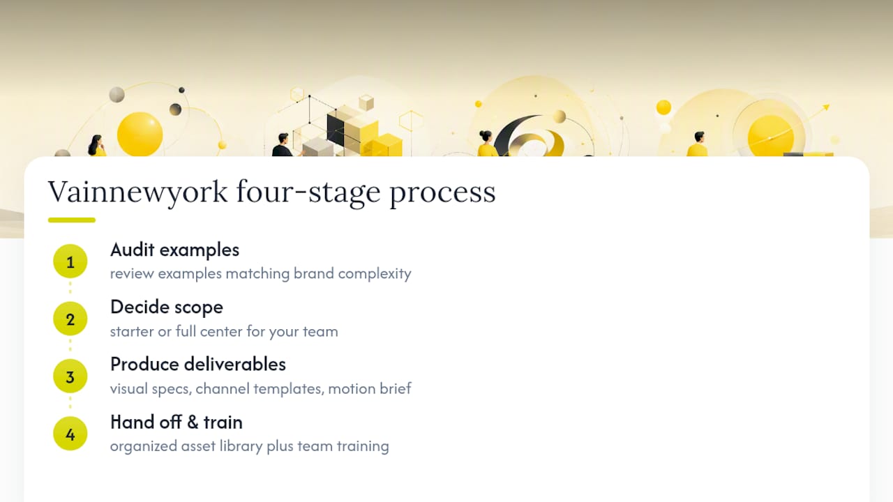
Studying Hulu’s PDF or Dow’s reviewer checklist is useful, but converting that inspiration into a working guide for your own brand is a different job. Vainnewyork approaches it in four stages: audit the examples closest to your brand’s complexity, decide the real scope your team needs (starter or full center), produce the actual visual and template files, and hand off with training so the guide gets used instead of filed away.
A typical engagement produces visual specs (logo, color, type), channel templates, a motion brief for any video or animation work, and an organized asset library your team can pull from without guessing which file is current. That last piece matters more than most brands expect: a guide with no accessible asset library becomes a PDF nobody opens after month one.
Starter Guide or Full Brand Center: How to Choose
A starter guide wins on speed, clarity, and internal buy-in.
A full brand center earns its cost when governance and scale become the actual problem: multiple departments, outside agencies, or partner brands all touching your assets without a shared reference. Consistent brand application directly supports business growth, and that payoff compounds as more people touch the brand.
The sane roadmap moves in that order: starter first, prove it gets used, then expand into templates, motion specs, and a portal once the volume of collaborators justifies the investment.
— Vain.
Build Your Brand Guide With Vainnewyork
Vainnewyork is the alternative to piecing together a guide from borrowed PDFs and guesswork. Where the examples above show you what a finished system looks like, we build the actual one, with strategy, visual identity work, application templates, and motion briefs handled by a single collaborative team instead of five freelancers who never talk to each other.
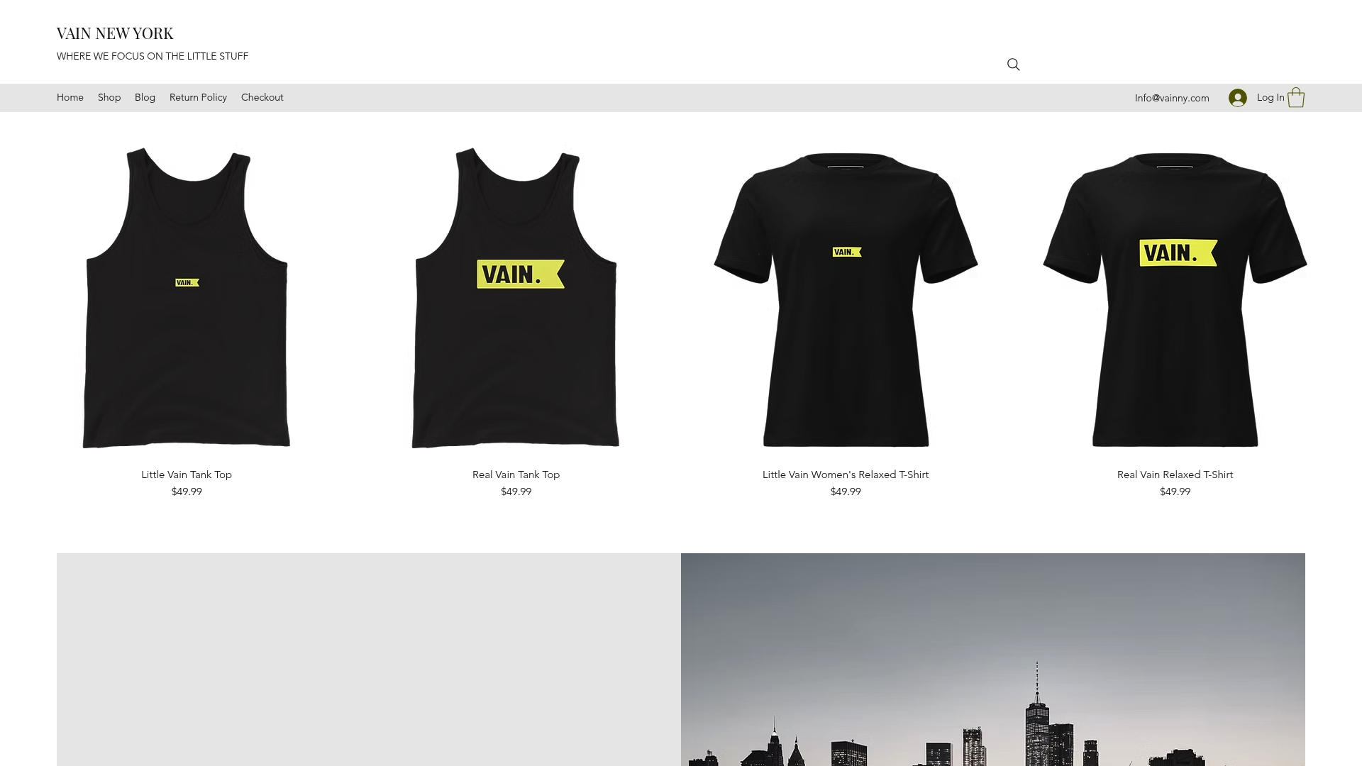
A typical engagement starts with an audit of your current assets (or lack of them), moves into a scoped visual identity system covering logo, color, and type, and produces the channel templates and motion specs your team will actually reach for under deadline. If your brand sells physical goods alongside services, that same system extends cleanly into merchandise like a Studio Hoodie or apparel line, so the identity holds together whether it’s on a landing page or a garment tag.
Ready to stop patchworking your brand together? Get in touch with Vainnewyork to scope your visual identity system and see what a starter guide or full brand center would look like for your team.
Sources
FAQ
What does a brand style guide include?
A complete guide covers logo rules, color and typography systems, voice and editorial standards, application templates for channels like social and email, governance rules including a misuse page, and accessibility standards like contrast ratios and captioning guidance.
What are the 5 C’s of branding?
Definitions vary across marketing sources, and no single version appears consistently enough across authoritative guides to state one canonical list here. Focus instead on the elements this article covers directly: clarity, consistency, and context of use, which show up repeatedly across every strong example examined.
What is the 3-7-27 rule of branding?
This isn’t a standard or widely documented branding framework, and no authoritative brand guide referenced in this article defines it. If you’ve encountered it elsewhere, treat it cautiously rather than as an established industry rule.
How much does it cost to build a brand style guide with Vainnewyork?
Pricing depends on scope, since a starter guide and a full brand center involve very different amounts of work. Current service pricing is available directly on Vainnewyork’s site.
Recommended
Comments