12 Creative Pitch Deck Examples Founders Can Copy in Figma or Canva


This roundup gathers twelve creative pitch deck examples worth studying, plus the editable templates behind them, so you can borrow what works instead of starting from a blank slide. Begin with Figma, Pitch, or Canva to duplicate a design fast, then adjust the story to fit your own numbers. If you only have ten minutes, jump to the gallery below and pick one structure to build on today.
TL;DR:
Using a single strong metric on the cover slide can immediately capture investor attention and set the tone for the rest of the deck.
Visual storytelling techniques like before-and-after arcs and real case-study snapshots enhance emotional and practical engagement.
Data-driven decks that focus on clear metrics such as performance lifts or market size projections tend to resonate better with investors, especially when paired with concrete proof.
Choosing a template aligned with your evidence type, then customizing with authentic data and assets, produces a more credible and compelling presentation.
Building a cohesive narrative with a consistent visual style, rather than relying solely on templates, helps create a memorable and persuasive pitch.
Table of Contents
12 Creative Pitch Deck Examples Worth Studying
Every deck on this list earns its place because it solves a specific storytelling problem: how to make a market feel urgent, a product feel obvious, or a team feel inevitable. We grouped them by design approach, since the visual language you choose says almost as much as your numbers.
Minimal and confident
The single-metric cover. One number, one line of context, nothing else on the opening slide. It works because attention is scarcest in the first five seconds, and a lone metric forces the room to ask a question instead of skimming a paragraph. Best for founders with one standout traction figure. Duplicate a clean cover layout in Canva.
The whitespace product shot. A single hero image of the product against a plain background, with copy reduced to a caption. It reads as confidence rather than emptiness, and it photographs well when screenshotted for social sharing. Good for hardware, apps, or anything visually self-explanatory.
The monochrome deck with one accent color. Every slide shares a strict palette except for a single highlight color reserved for the ask or the key metric, training the eye to notice what matters. Works well for enterprise or B2B pitches where restraint signals seriousness.
Bold and visual
The oversized-type manifesto. Giant type, almost no imagery, one bold claim per slide. This style borrows from editorial design and works because it forces founders to write shorter, sharper sentences. Fits consumer brands with a strong point of view.
The full-bleed photography deck. Every slide is a full-screen image with text overlaid, closer to a magazine spread than a slide deck. It works for lifestyle, hospitality, or media companies where mood matters as much as mechanics.
The illustrated brand-world deck. Custom illustration instead of stock photography or screenshots, building a visual universe unique to the brand. Costs more production time but pays off for consumer products competing on identity, not just utility.
Narrative and story-driven
The before-and-after arc. Structured as a short story: life before the product, the moment of friction, life after. This mirrors classic narrative structure, and it works because problem-solution slides feel abstract until a reader can picture the “before” scene. Strong for investor decks where the problem is emotional as well as practical.
The founder-origin deck. Opens with a short, specific anecdote about why the founder started the company, then pivots into the business case. Useful when the founder’s personal credibility is part of the pitch, less useful for later-stage rounds where operators care more about metrics.
The case-study composite. Instead of abstract claims, the deck stitches together three or four real client snapshots, each with a before number, the intervention, and an after number. This is one of the more persuasive formats for DocSend’s analysis of investor engagement, since concrete numbers hold attention longer than dense prose.
Data-driven and systems-focused
The flywheel deck. A circular diagram shows how each part of the business feeds the next, acquisition into retention into referral into acquisition again. One flywire fundraising executive has called a single flywheel slide the deciding factor in a venture pitch, because it shows investors the model compounds instead of resetting every quarter.
The market-size-and-macro-trend deck. Anchors the opportunity in an external forecast rather than founder optimism alone. One recent AI adtech raise built its market slide around a McKinsey projection that streaming video could reach 43% of consumer entertainment spend by 2040, up from 24% in 2022, giving the pitch a scale argument bigger than the company itself.
The performance-metrics deck. Built around a KPI table rather than a narrative, showing click-through, conversion, or retention lifts tied directly to product features. A recent advertiser-facing pitch reportedly cited a 140% rise in click-through rate and a 43% lift in conversion from a specific feature rollout. That kind of framing suits advertising, adtech, or performance-marketing pitches where buyers evaluate everything against outcomes.
Where to Find Editable Templates and How to Pick One
Six platforms dominate the template landscape, and each is built for a different kind of pitch.
Figma is the best starting point for founders who want full design control and are comfortable dragging elements around; its pitch deck template library is collaborative, so a designer and founder can edit the same file live.
Pitch leans toward animated transitions and polished team templates, useful if you want motion without hiring an animator.
Canva is the fastest option for non-designers, with drag-and-drop templates that still look intentional rather than generic.
Slidebean focuses specifically on startup fundraising templates and pairs well with its own archive of pitch decks from 35-plus funded startups, useful for benchmarking slide order.
Deck.gallery works best as inspiration rather than an editing tool. Browse it to shortlist a visual direction before you build.
DocSend isn’t a design tool at all. It is where you send the finished deck, and it tracks which slides investors actually spend time on.
Matching a template to your goal matters more than picking the prettiest one. Investor decks reward brevity and a strong flywheel or traction slide; client decks reward case studies and visual proof of past work. Once you pick a template, swap in your brand colors first, trim the slide count to what your story needs, and replace any placeholder icons with real product screenshots before you send it anywhere.
Design Rules That Make a Deck Memorable
Good design decisions in a pitch deck are almost always subtraction, not addition. Visual hierarchy means the biggest, boldest element on a slide should be the one thing you want remembered, not the logo or a decorative graphic. Contrast between text and background should be strong enough to read from across a conference room, and body copy should stay above 18 points when projected. Pacing matters too: a deck that spends four slides explaining the problem loses the room before it reaches the solution.
Imagery versus iconography is a real decision, not a style preference. Custom photography or illustration signals a consumer brand investing in identity; simple line icons signal an enterprise or technical pitch where clarity beats personality. Pick one lane and stay in it for the whole deck.
Data visualization has one job: highlight the insight, not the dataset. A single trendline with one callout label beats a five-series chart every time, and a single-metric slide almost always outperforms a dashboard screenshot. When agencies or platforms want to show a proprietary workflow, a short diagram plus a number for time saved or revisions reduced does more persuasive work than a paragraph of description.
Creative techniques worth stealing: a flywheel diagram for anything with a compounding growth loop, a short embedded product demo (even a 15 second clip) for anything visual, and a case-study composite slide for anything selling a service rather than a product.
Pro Tip: Build your data slides in grayscale first. If the insight is still obvious without color, your hierarchy is working. Add the accent color last, and only where you want the eye to land.
A Creative Investor Deck You Can Copy, Slide by Slide
Cover slide. One line describing what you do, one image or metric, nothing else.
Problem. Frame it as a scene, not a statistic. Show who feels this pain and how often.
Solution. One sentence plus a screenshot or short demo clip, not a feature list.
Product demo. A 10 to 15 second embedded clip or a three-frame sequence beats a paragraph of explanation.
Market size. Anchor it to a credible external forecast rather than a founder-built total addressable market number alone.
Traction. One chart, one trendline, dated clearly. Resist the urge to show every metric you track.
Business model. How money moves, in one diagram.
Flywheel or operating model. Show how growth compounds or how your workflow scales without linear headcount growth.
Team. Photos, past outcomes, and why this specific group solves this specific problem.
Financials. Three years, one chart per metric, avoid dense tables.
The ask. What you need, what it buys, and the milestone it unlocks.
Contact and next step. One slide, one clear way to reach you.
Keep the whole deck under fifteen slides and under ten minutes of talk time. Client-facing decks should swap slides 5 through 8 for case studies and past-work samples, since a prospective client cares more about proof of execution than market forecasting.
How We Selected These Examples
We prioritized decks and templates with editable source files or verifiable slide-by-slide screenshots, since a design you can’t inspect closely isn’t useful to copy. Selection favored variety across style categories, minimal, narrative, data-driven, and visual, over volume, and we checked each platform recommendation against current template availability rather than relying on older reviews. Two recent adtech fundraising decks were included specifically because their public reporting broke down slide content in detail, which is rare and worth studying closely.
What Happens When Founders Actually Use These Formats
The pattern across recent high-profile raises is consistent: decks that pair a strong visual system with hard performance numbers close faster than decks relying on either alone. The adtech platform that built its raise around AI and streaming growth projections didn’t just show a mockup. It paired the flywheel and market-size narrative with a specific claim about the workflow it automates, giving investors both the vision and the mechanism.
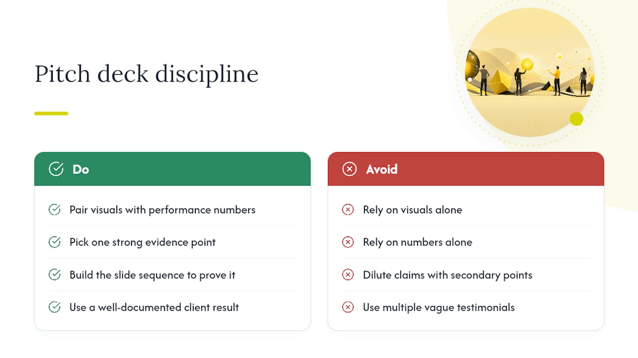
The advertiser-facing platform pitch followed a similar logic from the opposite direction. Instead of leading with vision, it led with a performance table showing click-through and conversion lifts, then let the product story follow the numbers. Both decks succeeded with different audiences using the same underlying discipline: pick one strong piece of evidence, build the slide sequence around proving it, and don’t dilute it with secondary claims.
The lesson for a founder without a nine-figure raise behind them is scale-agnostic. A single well-documented client result, even a small one, does more work than three vague testimonials. If you’re using a case-study composite approach, pick your strongest pilot and let its numbers carry the slide.
Customizing These Examples for Your Own Story
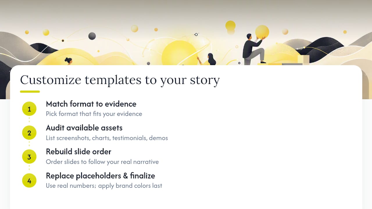
Start by identifying which of the twelve formats above matches your evidence, not your taste. A founder with one dramatic before-and-after client result should use the narrative arc, not the data-driven format, even if a spreadsheet feels more “serious.” The format should follow the strongest thing you can prove.
Next, audit your actual assets before you touch a template. List every screenshot, chart, testimonial, and demo clip you have on hand. If you don’t have a working product demo yet, don’t force a product-demo slide into the sequence, replace it with a wireframe walkthrough or a founder explainer instead.
Then rebuild the slide order around your real narrative, not the template’s default order. Templates are starting scaffolding, not a fixed script. If your traction story is stronger than your market-size story, move traction earlier and shrink the market slide to a single line.
Finally, replace every placeholder number with your own, even rough ones. A deck with real, modest figures reads as more credible than a polished deck with obviously borrowed sample data. Once the story and numbers are locked, apply your brand colors and typography last. Tools like marketing analytics reviews can help you decide which real numbers are worth featuring before you commit them to a slide.
Vain.'s Take on Creative Decks and the Workflow Behind Them
We build creative decks the way we build creative campaigns: design, production, and measurement working together instead of design handed off at the end. A deck is only as strong as the story and proof behind it, which is why our approach pairs visual craft with the kind of production workflow that keeps assets consistent from first draft to final send. If you’re weighing a done-for-you build against a template, that’s a question worth asking us directly.
— Vain.
Get a Creative Pitch Deck Built Around Your Story
Templates get you most of the way there, but they can’t write your narrative or produce the custom visuals that make a deck memorable to a specific investor or client. An alternative to piecing together a deck from scattered templates is to have a team design, write, and produce the deck as one project, so the flywheel diagram, the case-study slide, and the product demo clip all come from the same creative hand instead of three different tools stitched together.
That matters most when your pitch depends on a custom animation, a branded illustration style, or a demo clip that a stock template simply can’t fake. If your next raise or client pitch needs a deck that looks and reads like nothing else in the room, visit Vainnewyork and start a conversation about your project. For agencies and platforms wanting to pair a creative deck with scalable ad testing, Popjam are worth a look as a complementary resource. Reach out through the relevant site to scope your deck and get a production timeline back promptly.
Sources
Recommended
Comments