Color Psychology in Apparel Design: A 2026 Guide
- Vain.

- Jun 25
- 8 min read
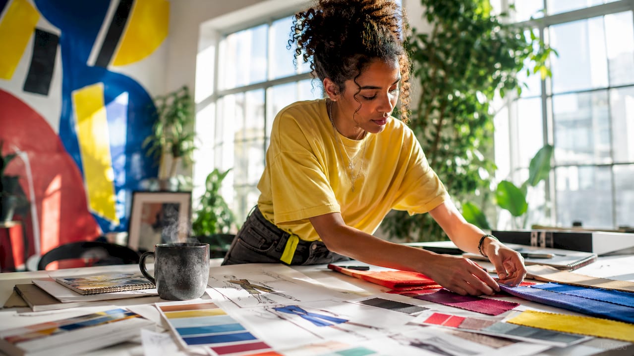
Color psychology in apparel design is the study of how specific colors shape consumer emotions, perceptions, and purchase decisions, making it one of the most powerful tools a fashion designer or marketer can master. A 2026 integrative literature review confirms that color functions as both an aesthetic and psychological stimulus, influencing buyers through cognitive, affective, and behavioral mechanisms. The role of color psychology in apparel design goes far beyond picking a seasonal palette. It is a craft that, when applied with intention, shapes how consumers feel about a garment before they ever touch it. At Vainnewyork, we see this play out in every collection and campaign we help build.
How does color psychology shape apparel design decisions?
Color psychology in clothing operates across three layers: cognition, emotion, and action. Cognition is how a consumer categorizes and evaluates a garment at first glance. Emotion is the feeling that color triggers. Action is whether they reach for it, add it to their cart, or walk past. According to a 2026 literature review, color effects in apparel should be planned as a system that addresses all three layers simultaneously. Treating color as decoration alone leaves significant consumer impact on the table.
The concept of enclothed cognition adds another dimension. Enclothed cognition research shows that wearing a garment with symbolic meaning actively shifts the wearer’s psychological state, boosting confidence and attention. A red blazer does not just signal power to observers. It changes how the person wearing it thinks and performs. For apparel designers, this means color is not just a visual choice. It is a psychological contract between the garment and the wearer.
Apparel design color theory provides the structural framework here. Hue, saturation, and value each contribute differently to emotional response and visual clarity, especially under the varying lighting conditions of retail floors and digital storefronts. A deep navy at full saturation reads as authoritative. The same hue desaturated reads as casual and approachable. Understanding these dimensions gives designers precise control over the emotional effects of color before a single sample is cut.

What emotional effects do warm and cool colors create in fashion?
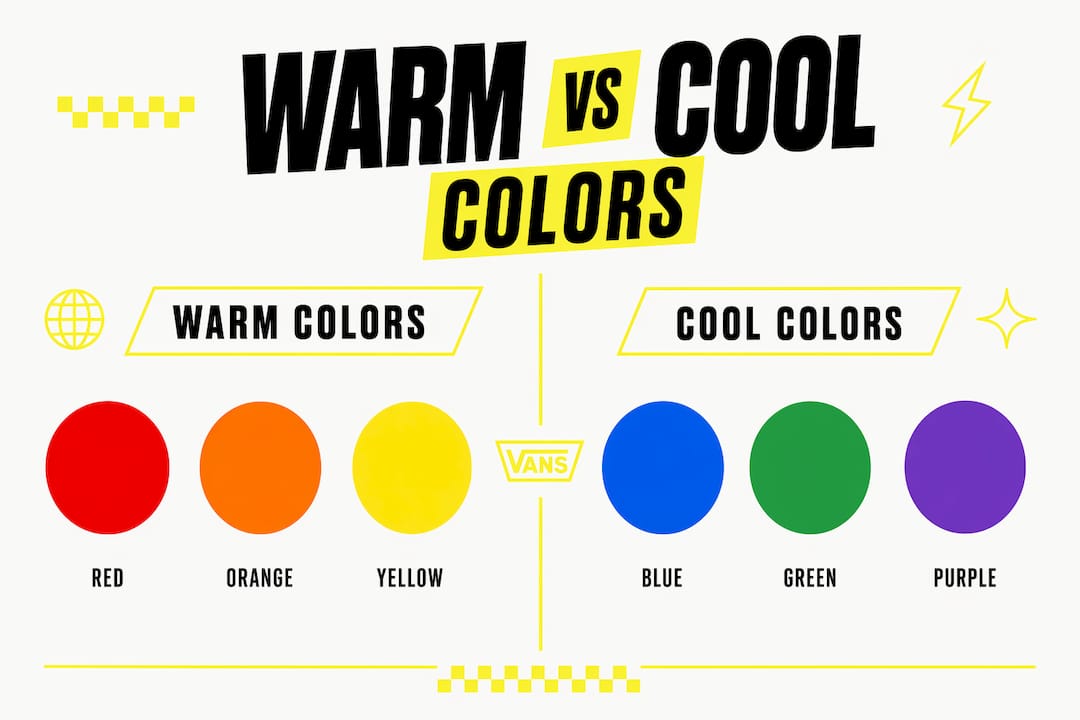
Warm and cool colors produce measurably different emotional responses in apparel contexts. A 2026 empirical study with 137 participants found that warm hues like red and orange increase urgency and purchase intention, while cool hues like blue and green promote trust and aesthetic appreciation. That distinction is not subtle. It is the difference between a shopper who impulse-buys and one who deliberates and returns.
Here is how the emotional associations break down by color family:
Red and orange trigger urgency, excitement, and appetite. Fashion brands use red in sale banners, limited-edition drops, and activewear for exactly this reason.
Blue and green build trust, calm, and credibility. Brands targeting wellness, sustainability, or premium positioning lean heavily on these hues.
Black communicates authority, luxury, and timelessness. It is the backbone of high-fashion identity from Chanel to Rick Owens.
White and neutral tones signal cleanliness, minimalism, and accessibility. Direct-to-consumer brands often use these to lower perceived risk for first-time buyers.
Yellow and gold evoke optimism and warmth, but require careful calibration since overuse reads as cheap rather than cheerful.
The same 2026 e-commerce study noted that millennials showed slightly higher responsiveness to color-driven emotional cues than other age groups. That finding matters for brands whose primary audience sits in the 25–40 demographic. Color choices in apparel targeting this group carry more psychological weight than they do for older or younger cohorts.
Pro Tip: Never select a color based on trend alone. Map the emotional goal first, then find the hue that delivers it. A color that drives urgency in a sale campaign will undermine trust in a premium product launch.
How does visual context change the way color is perceived in clothing?
Color does not exist in isolation. The same garment can look entirely different depending on the lighting, background, and surrounding products it is displayed alongside. 2026 optics research argues that visual context alters perceived color appearance so significantly that it can override precise color difference measurements. A dusty rose that photographs beautifully in a bright studio can read as washed-out beige under warm retail lighting. Designers who ignore this pay for it in returns and customer disappointment.
Cultural context compounds the challenge. Color meanings are not universal. White signals purity in Western markets and mourning in several East Asian cultures. Green carries environmental associations in North America and Europe, but reads as luck or prosperity in parts of the Middle East. Color meanings vary by culture, and apparel brands that operate across markets need culturally calibrated palettes, not a single global color story.
A practical approach to context-aware color testing follows four steps:
Simulate the actual consumption environment. Test garments under the lighting conditions of your primary retail channel, whether that is a boutique, a department store floor, or a product photography setup for e-commerce.
Test against realistic backgrounds. A garment displayed on a white mannequin reads differently than the same piece on a model against a lifestyle backdrop.
Evaluate across digital and physical formats. Screen rendering and print production shift color significantly. Lock down both before finalizing a palette.
Gather audience-specific feedback. Run color preference tests with your actual customer segment, not a general population sample.
Pro Tip: When shooting apparel product photography, always capture swatches alongside the full garment. This gives your team a reference point to catch color drift between the studio and the final digital asset.
How does color build brand identity in apparel marketing?
Color is the fastest signal a brand sends. Before a consumer reads a logo or a tagline, they register color. Eye-tracking research with 90 participants confirms that color-coded stimuli significantly shift consumer attention during shopping. Brands that own a color, think Hermès orange or Tiffany blue, benefit from instant recognition that no amount of copy can replicate.
The table below shows how color strategy differs across apparel brand positioning goals:
Brand goal | Color approach | Example effect |
Drive urgency and sales | Warm hues, high saturation | Increases impulse purchase intent |
Build premium perception | Black, deep navy, muted tones | Signals exclusivity and quality |
Communicate sustainability | Earthy greens, natural neutrals | Builds trust with eco-conscious buyers |
Target youth and energy | Bright, saturated primaries | Creates energy and social shareability |
Establish wellness positioning | Soft blues, lavender, white | Promotes calm and credibility |
Enclothed cognition extends this logic from the observer to the wearer. When a brand consistently pairs a specific color with a specific identity, the garment becomes a psychological artifact. Wearing a brand’s signature color is not just a style choice. It is an act of identity alignment. Custom apparel that differentiates brands uses this principle deliberately, building collections where color and symbolic meaning reinforce each other at every touchpoint.
Color naming also amplifies psychological effect. Calling a shade “Midnight Storm” instead of “dark blue” activates richer mental imagery and emotional association. Fashion brands like Pantone, which publishes its annual Color of the Year, understand that naming is part of the color strategy, not an afterthought. The name shapes the story the consumer tells themselves about the garment.
What are the best practices for applying color psychology in apparel?
Effective color strategy in apparel design goes well beyond choosing a palette that looks good on a mood board. The impact of color in fashion depends on how precisely that palette is specified, tested, and deployed across every consumer touchpoint.
Specify beyond hue. Define saturation and value alongside hue for every color in your palette. A color specified only by name will shift unpredictably across fabrics, dye lots, and screen profiles.
Test in context, not isolation. Context-sensitive color evaluation is the standard recommended by vision science. Test your palette in the actual display environment before committing to production.
Align color with your marketing goal. The same color performs differently depending on whether the goal is urgency, trust, or aesthetic appeal. Match the hue to the outcome you need.
Integrate color with typography and layout. Typography in apparel design interacts directly with color to shape overall brand perception. A bold sans-serif in white on black reads very differently than the same type in gold on navy.
Account for demographic nuance. Millennials respond more strongly to color-driven emotional cues. Adjust palette intensity and warmth based on your primary audience segment.
The most common mistake designers make is finalizing color under studio conditions and never testing it in the environment where consumers will actually encounter it. Retail lighting, digital screens, and outdoor photography all transform color in ways that a controlled studio cannot predict. Locking down the consumption scene context before fine-tuning a palette is the single most effective step a designer can take to close the gap between intention and perception.
Key takeaways
Color psychology in apparel design is a system that works across cognition, emotion, and behavior, and it only delivers its full impact when tested in the real environments where consumers encounter clothing.
Point | Details |
Color works as a system | Plan color effects across cognition, affect, and purchase behavior, not just aesthetics. |
Warm vs. cool hues serve different goals | Warm colors drive urgency; cool colors build trust and aesthetic appreciation. |
Context changes everything | Test color under actual retail and digital conditions before finalizing any palette. |
Cultural meaning varies | Align color choices with the cultural context of your specific audience segment. |
Enclothed cognition amplifies impact | Color paired with symbolic meaning shifts both wearer psychology and observer perception. |
Why I think most designers underuse color psychology
Color psychology gets treated as a finishing touch when it should be the starting point. I have watched talented designers spend weeks on silhouette and construction, then assign color in the final two days before a line sheet is due. That sequence produces beautiful garments that fail to connect emotionally with the consumer.
The research on enclothed cognition changed how I think about this. Color is not just what the observer sees. It is what the wearer feels. A garment in a specific color can shift the wearer’s confidence, focus, or mood before anyone else in the room reacts to it. That is a profound design opportunity that most brands leave unexplored.
The other mistake I see constantly is overgeneralizing color meanings. Red does not always mean urgency. In some cultural contexts it means celebration. In some brand contexts it means danger. The meaning is always a product of color plus context plus audience. Designers who treat color symbolism as a fixed rulebook will always be surprised by consumer reactions.
My recommendation is to build color testing into your design process the same way you build in fit testing. Evaluate your palette in the actual environments where your customer will encounter it, whether that is a boutique, an Instagram feed, or a product page. The gap between how a color looks in your studio and how it reads in the real world is where most color strategy falls apart.
— Neville
Color and craft at Vainnewyork
At Vainnewyork, color is never an accident. Every collection and campaign we develop starts with a clear psychological intention, whether that is building trust, creating desire, or signaling identity.
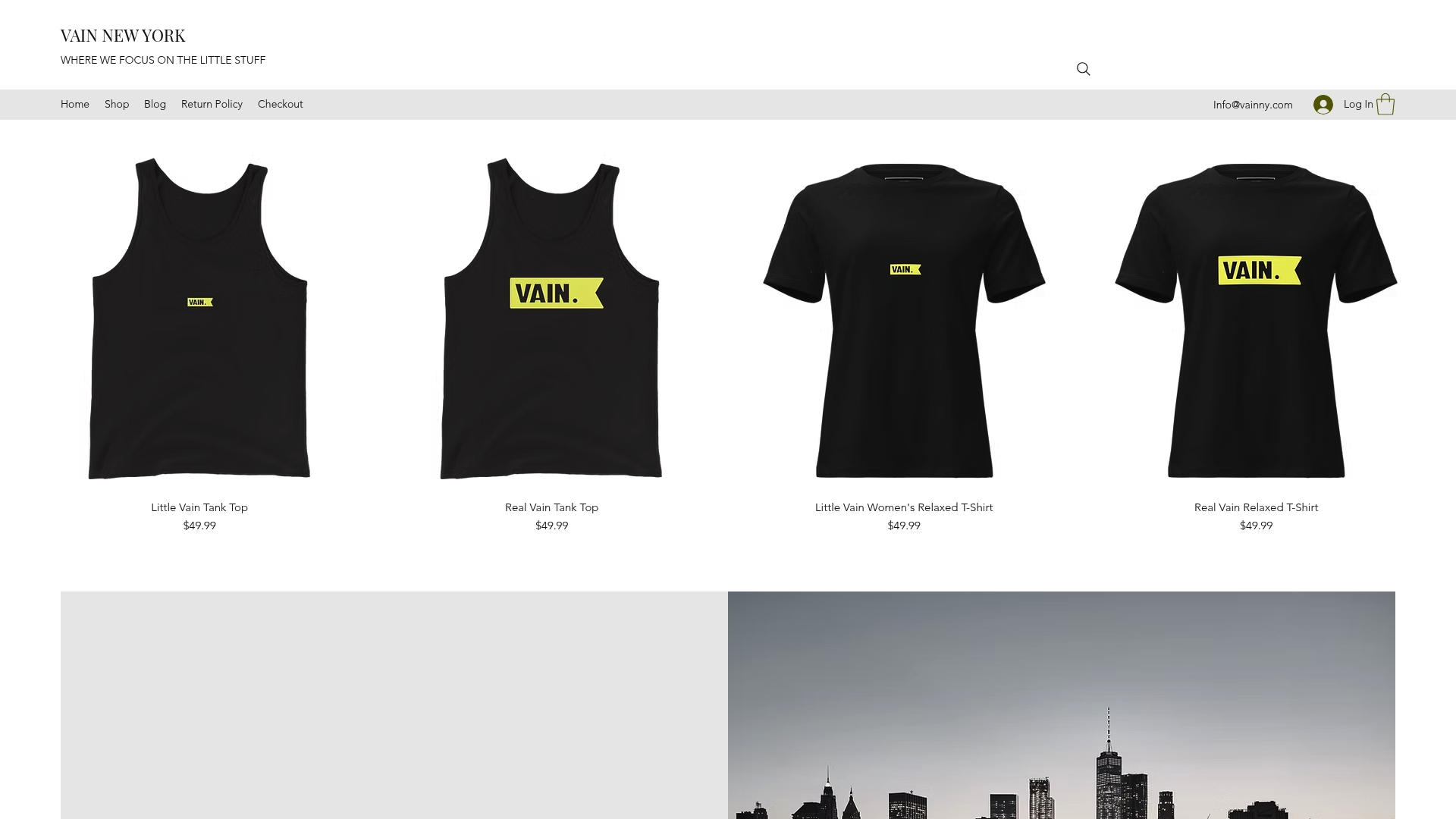
The Vainnewyork shop brings these principles to life in apparel designed with both visual impact and emotional resonance in mind. The Little Vain Auburn One-Piece Swimsuit is a direct expression of warm-hue psychology, using a rich auburn to project confidence and warmth. Browse the full Vainnewyork shop to see how color psychology shapes every piece we put into the world. Each item reflects a deliberate color story built for the wearer and the brand simultaneously.
FAQ
What is color psychology in apparel design?
Color psychology in apparel design is the study of how specific colors influence consumer emotions, perceptions, and purchase decisions. It draws on cognitive science, affective psychology, and behavioral research to guide color choices in clothing and branding.
How do warm and cool colors affect fashion buying behavior?
Warm colors like red and orange increase urgency and purchase intention, while cool colors like blue and green promote trust and aesthetic appreciation. A 2026 study with 137 participants confirmed these distinct emotional and behavioral differences in e-commerce apparel contexts.
Why does cultural context matter for apparel color choices?
Color meanings vary significantly across cultures. White signals purity in Western markets but mourning in several East Asian cultures. Apparel brands operating across multiple markets need culturally calibrated palettes to avoid misaligned messaging.
What is enclothed cognition and why does it matter for designers?
Enclothed cognition is the psychological effect of wearing a garment with symbolic meaning. Research shows it shifts the wearer’s own cognition and confidence, not just how observers perceive them. Designers can use this by pairing color with consistent brand symbolism.
How should designers test color before production?
Designers should test color in the actual environment where consumers will encounter the garment, including retail lighting, digital screens, and lifestyle photography setups. Testing in isolation under studio conditions does not predict how color will perform in real shopping contexts.
Recommended
Comments